
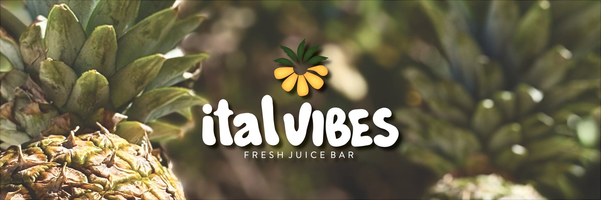
ital vibes
ital Vibes is a fresh-pressed juice company rooted in natural ingredients, vibrant energy, and feel-good living. They approached Stationhouse to develop a visual identity that captured their all-natural philosophy while standing out in a crowded wellness market.
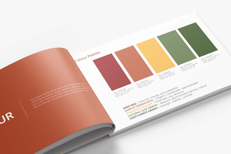
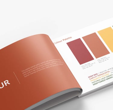
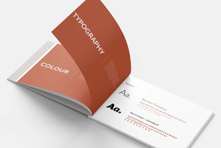
We crafted a full brand identity system built around warmth, vitality, and movement - anchored by a clean, modern logo and an uplifting colour palette inspired by fresh produce and island culture. The brand guidelines established clear direction for typography, tone, and visual usage to ensure consistency.
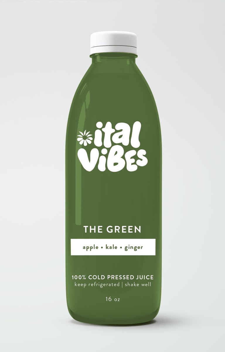
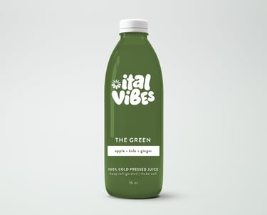
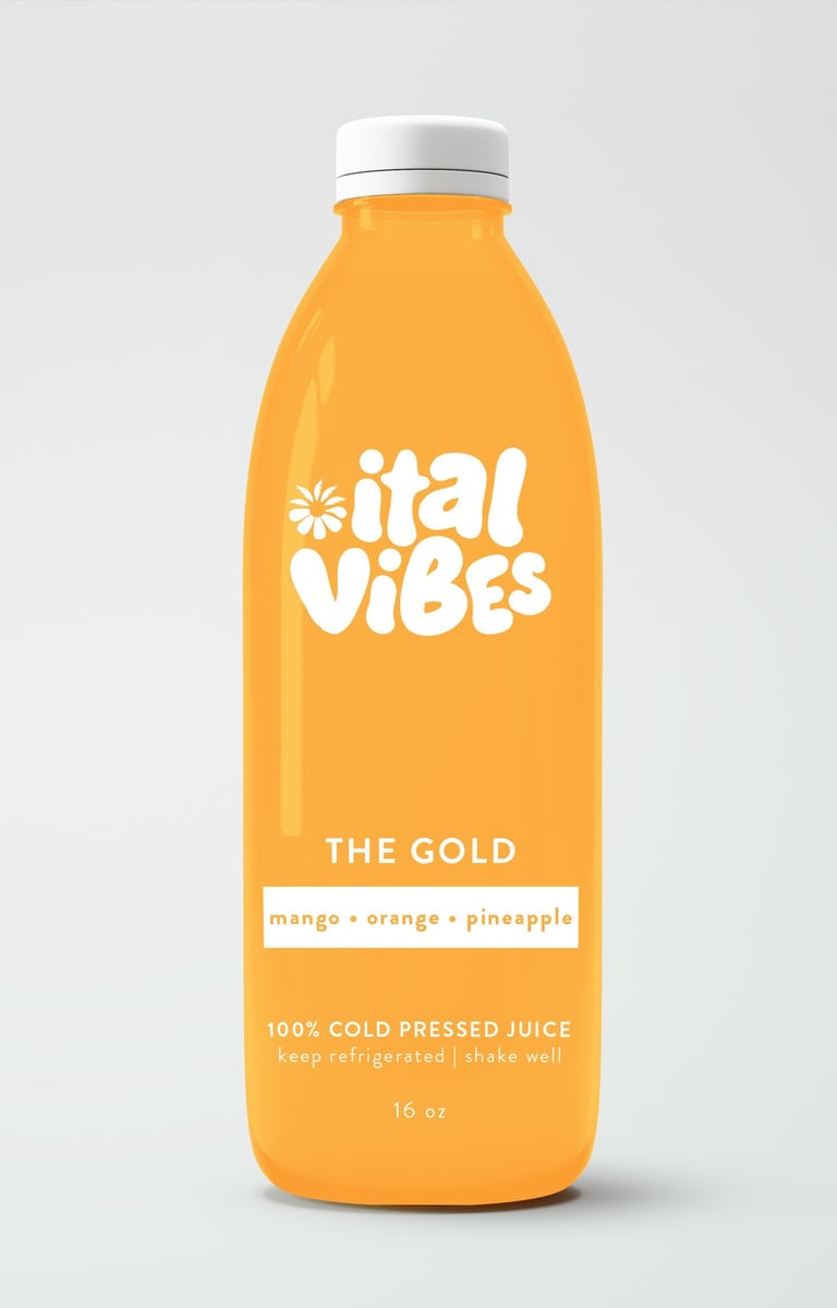
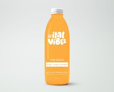
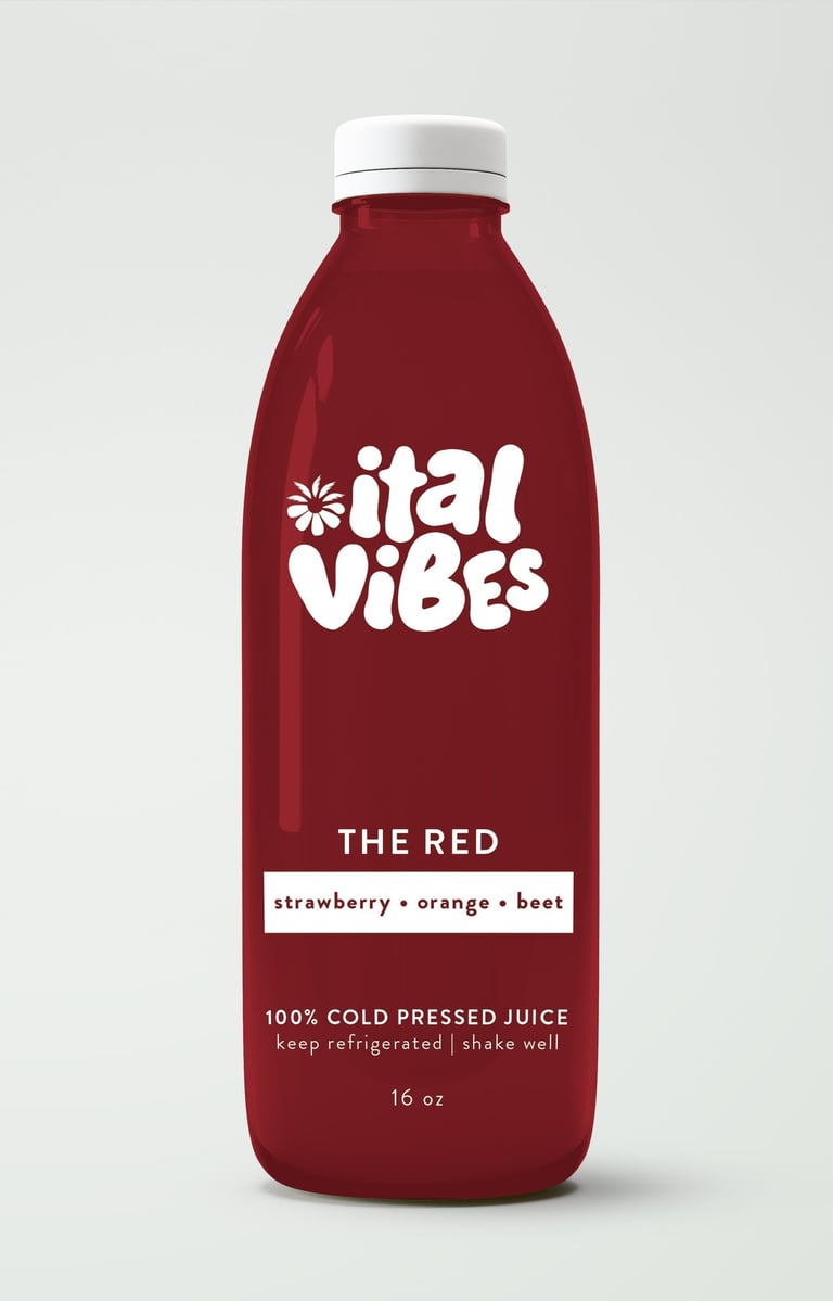
Product packaging was designed to be bold yet minimal, with an emphasis on clarity and shelf appeal. Each label balances nutritional transparency with colourful, upbeat design elements that reflect the brand’s happy, healthy personality.
To support their launch, we created promotional content including social media graphics and sales materials — helping ital Vibes introduce their products with confidence and cohesion.
Deliverables:
Logo Design + Brand Guidelines + Product Packaging + Promotional Content
Brand Identity, Print Design, Web & Marketing Design
Brand Identity
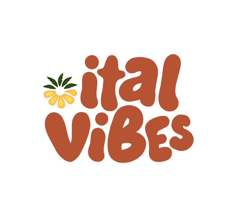
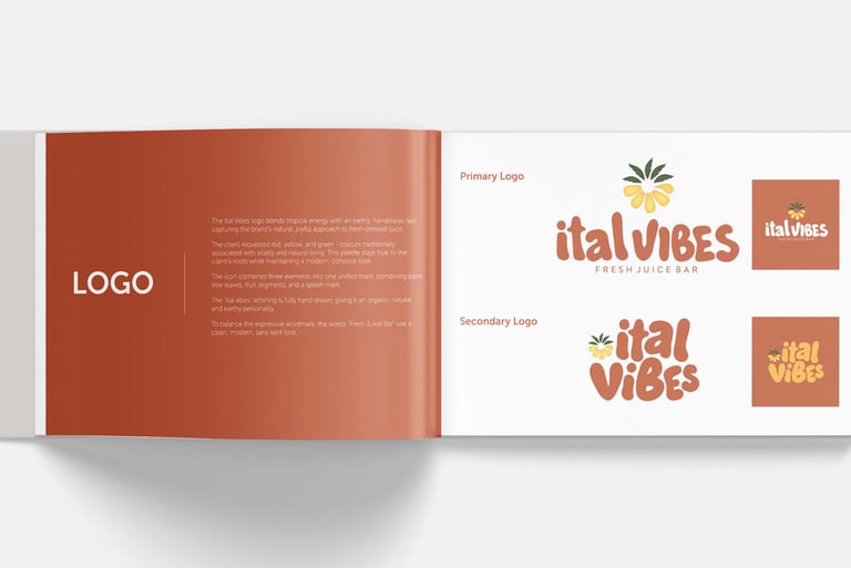
Logo Design
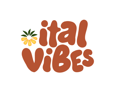
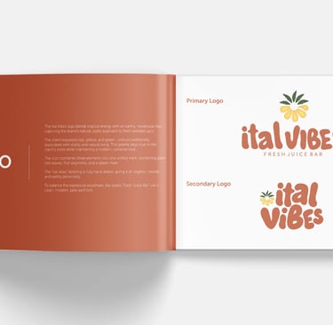
A custom logo designed to capture ital Vibes’ tropical, feel-good energy. The mark combines palm-inspired elements with fruit symbolism to reflect freshness, natural ingredients, and island warmth, while hand-drawn typography adds an organic, approachable personality that feels vibrant and inviting.


Secondary Logo
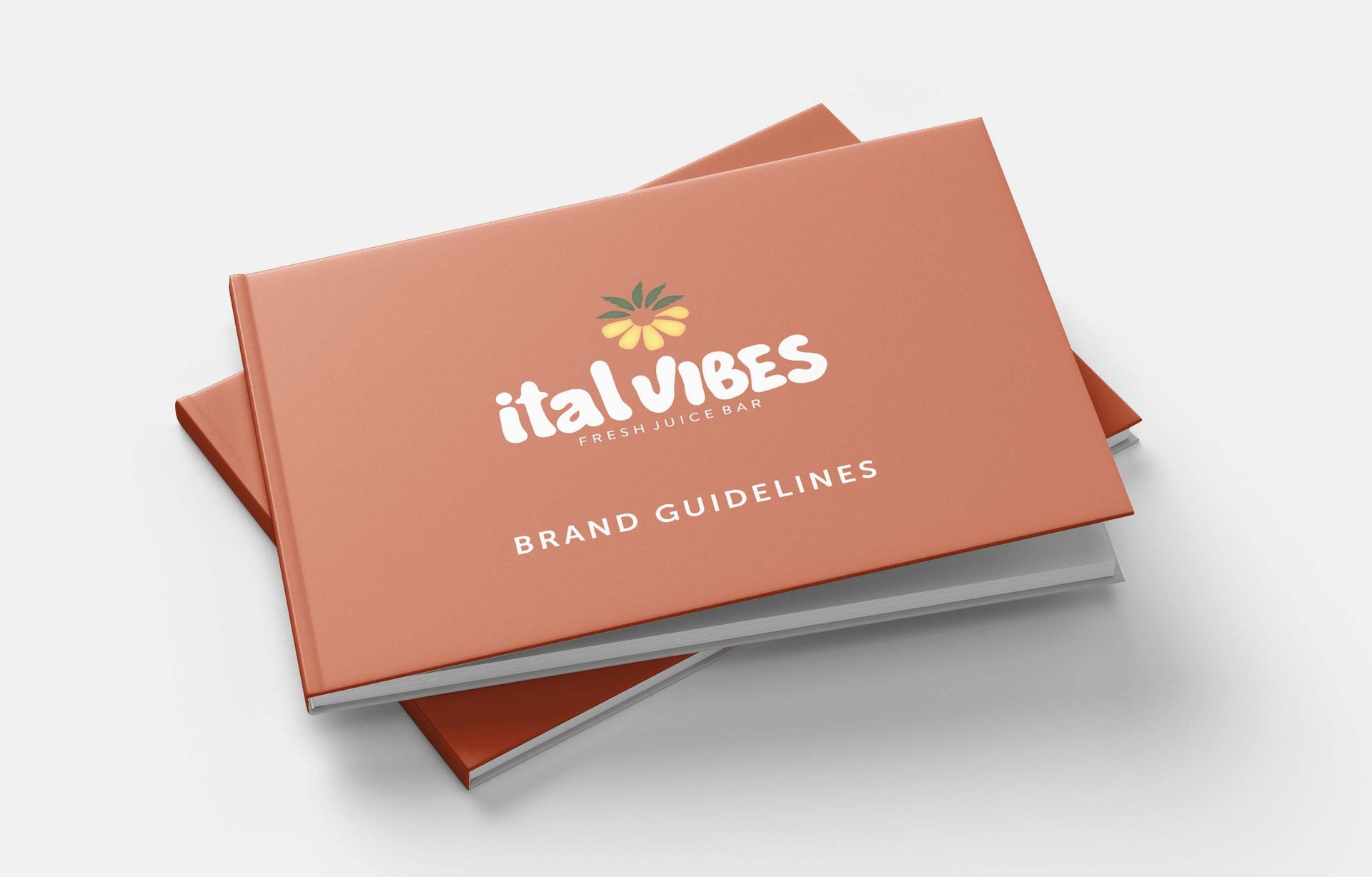
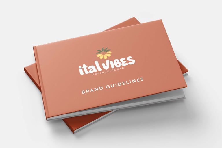
Brand Guidelines
Comprehensive brand guidelines developed for ital Vibes to ensure consistent use of logo, colour, typography, and visual elements across all platforms.

Marketing & Print Design
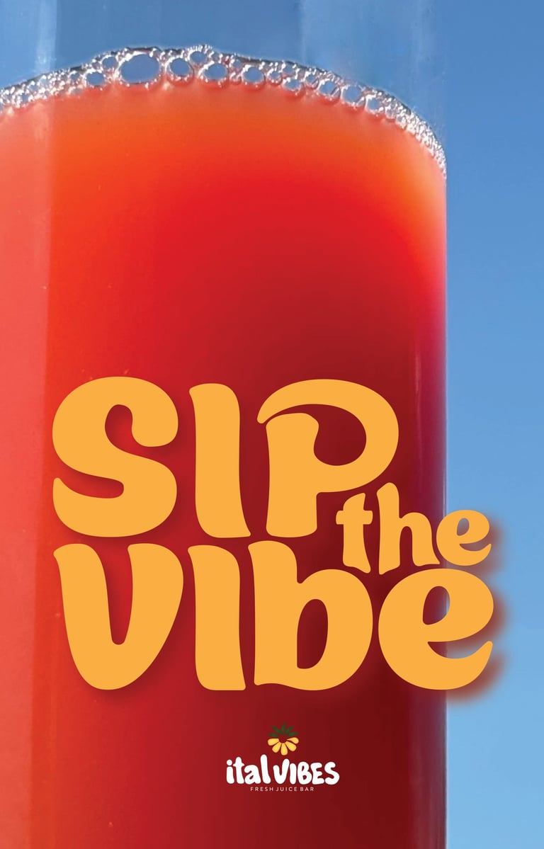
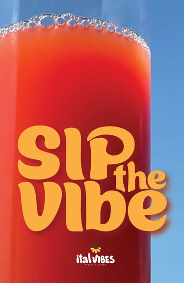
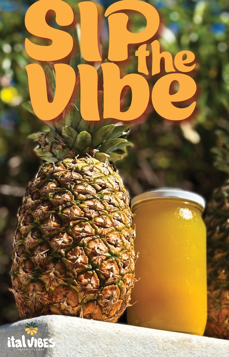
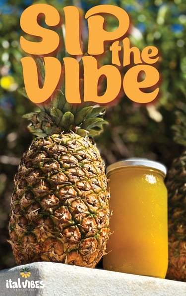
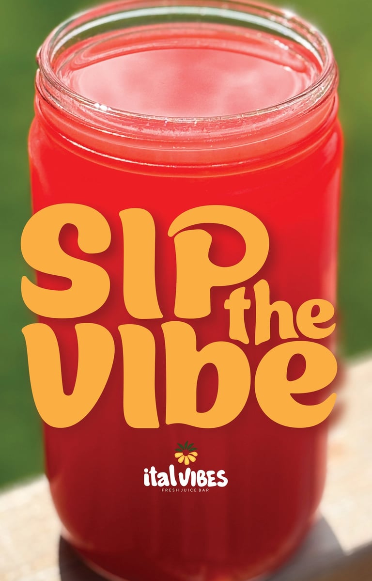
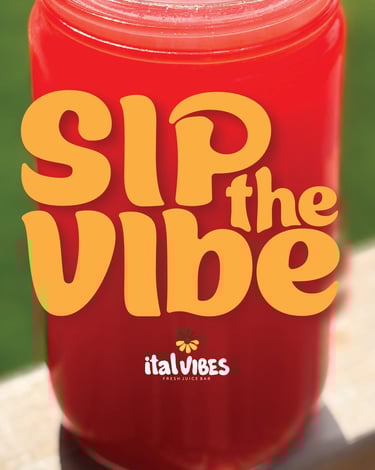
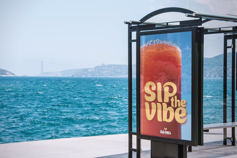
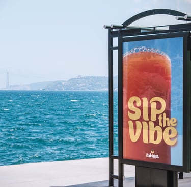
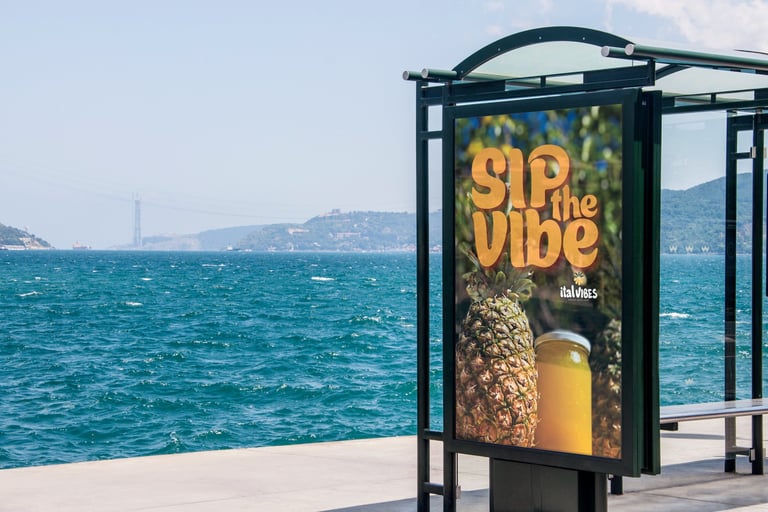
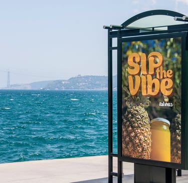
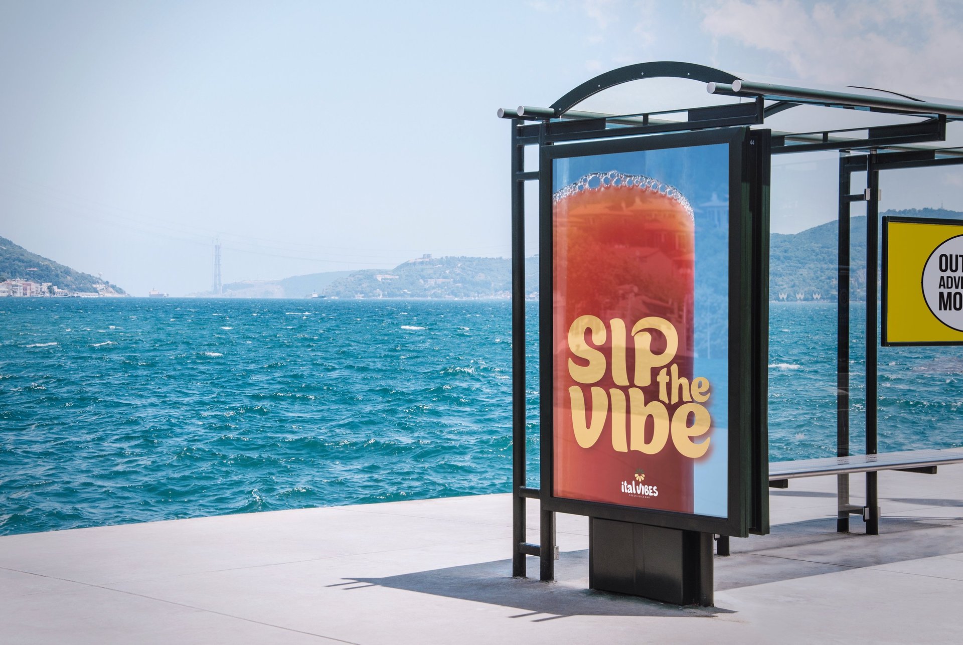
A promotional poster campaign designed to extend the Ital Vibes brand into high-impact print marketing, blending bold colour, playful typography, and lifestyle imagery.
Print Campaign
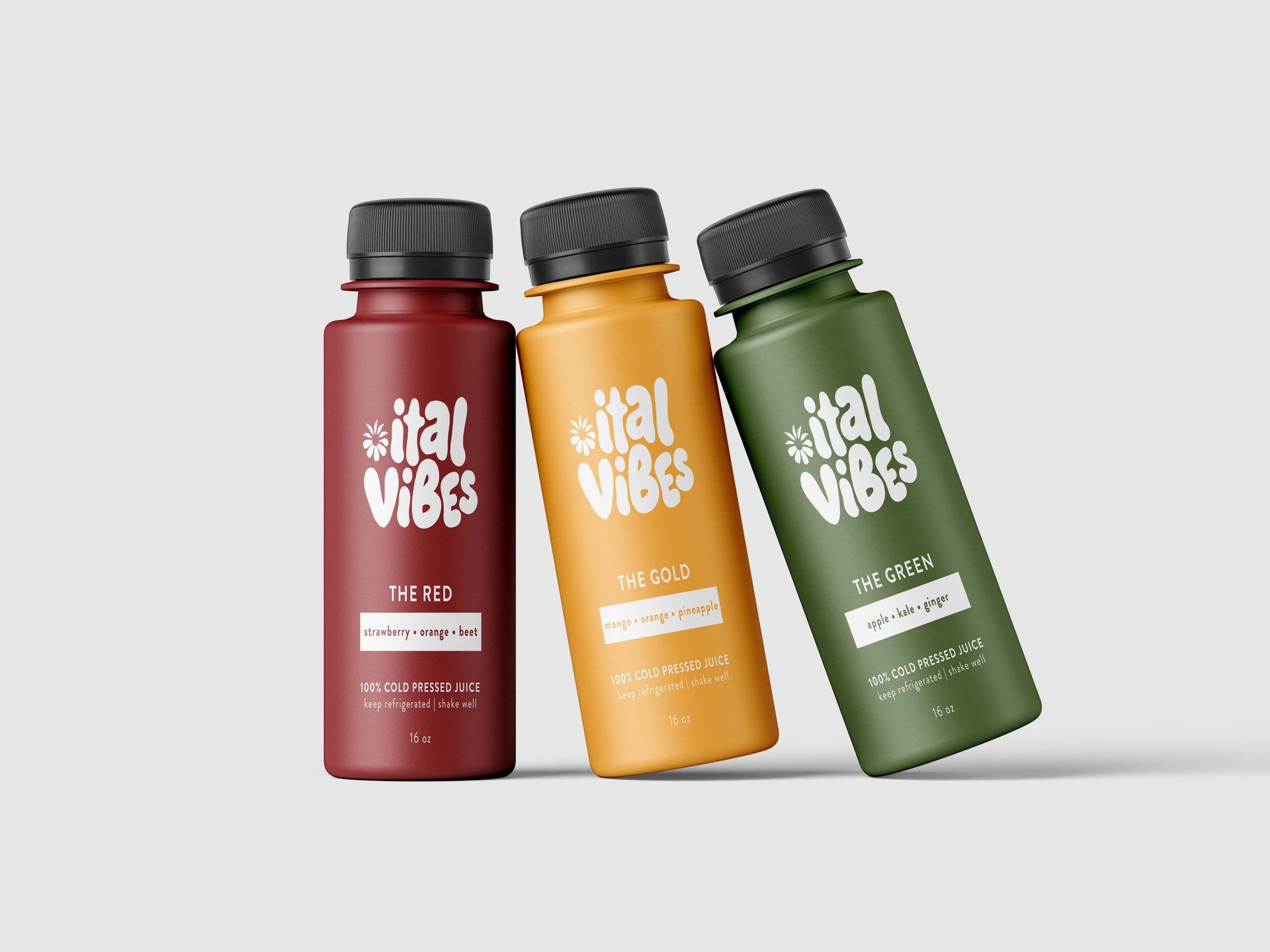
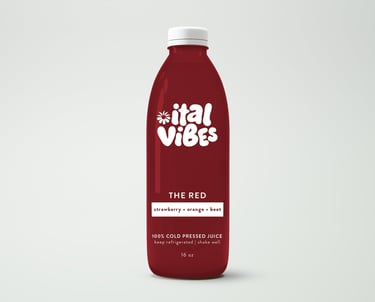
Packaging Design
Juice Bottle Label
Custom bottle labels designed for Ital Vibes, blending vibrant colour, clear information, and playful branding. The packaging is built around a cohesive red, gold, and green system — The Red, The Gold, and The Green — aligning each juice variety with the brand’s core colours for instant recognition, consistency, and strong shelf appeal.
Contact
Liana Sodonis
© 2025. All rights reserved.
613-402-2134
liana.sodonis94@gmail.com